A Lesson in Light and Color

A lesson in Light and Color
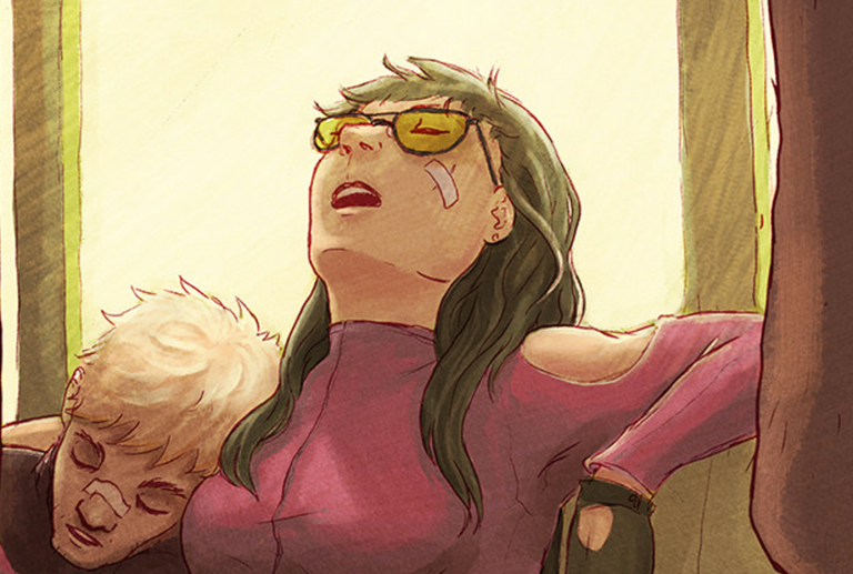
When working on illustrations, there are a number of things I like to take into consideration to make a solid piece. As an artist, I'm aware of all of the 'official' ones, but I don't necessarily remember to execute them. This sometimes leaves the illustration imbalanced in quality.
For this piece I focused on Composition, Line Quality, Color, Texture, and Light. But I think that Light and Color were the most important factors in pulling this together.
Composition
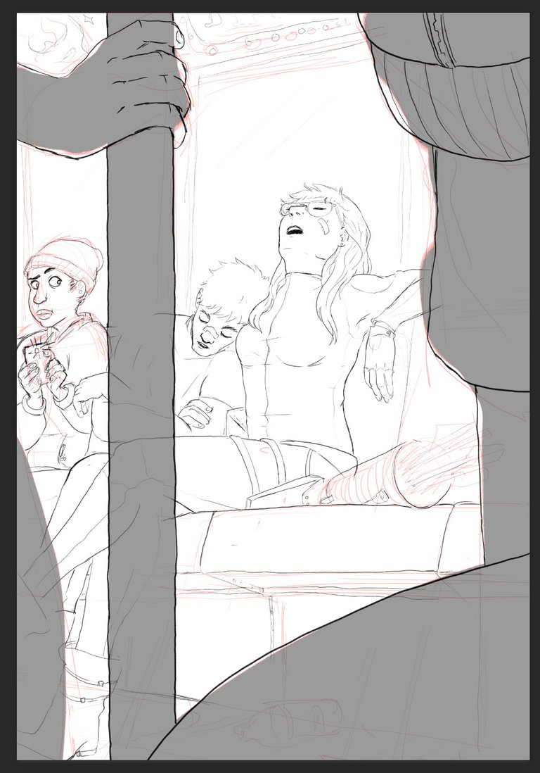
I think I did a pretty good job of this, I have a number of things that help direct the viewer to the focal point (the two sleeping heroes). I have the boy looking at and taking a picture of them, I have things in the foreground literally framing the characters, and I already determined what parts of the piece will be darkest and lightest.
Line Quality
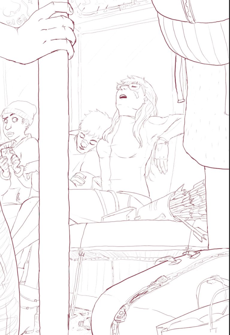
When creating line art, I don't always go the same route, but I prefer lines that don't look too clean. My lines tend to have an almost pencil line quality to them, just a little bit of texture, and very few perfectly straight lines. This works well with my style, which doesn't tend to be very rigid.
If you notice, the lines for the objects in the foreground are just a bit thicker than those in the mid-ground. This is enough to help the eyes not become confused when looking at a complex image.
Color
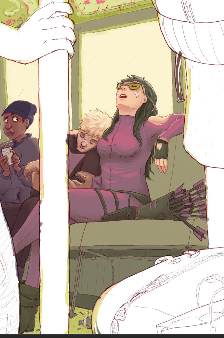
I don't usually do this, but for this illustration I tried limit my colors to only variations of a base 5. It evolved beyond that as I worked, but that starting point kept the piece incredibly unified.
Texture
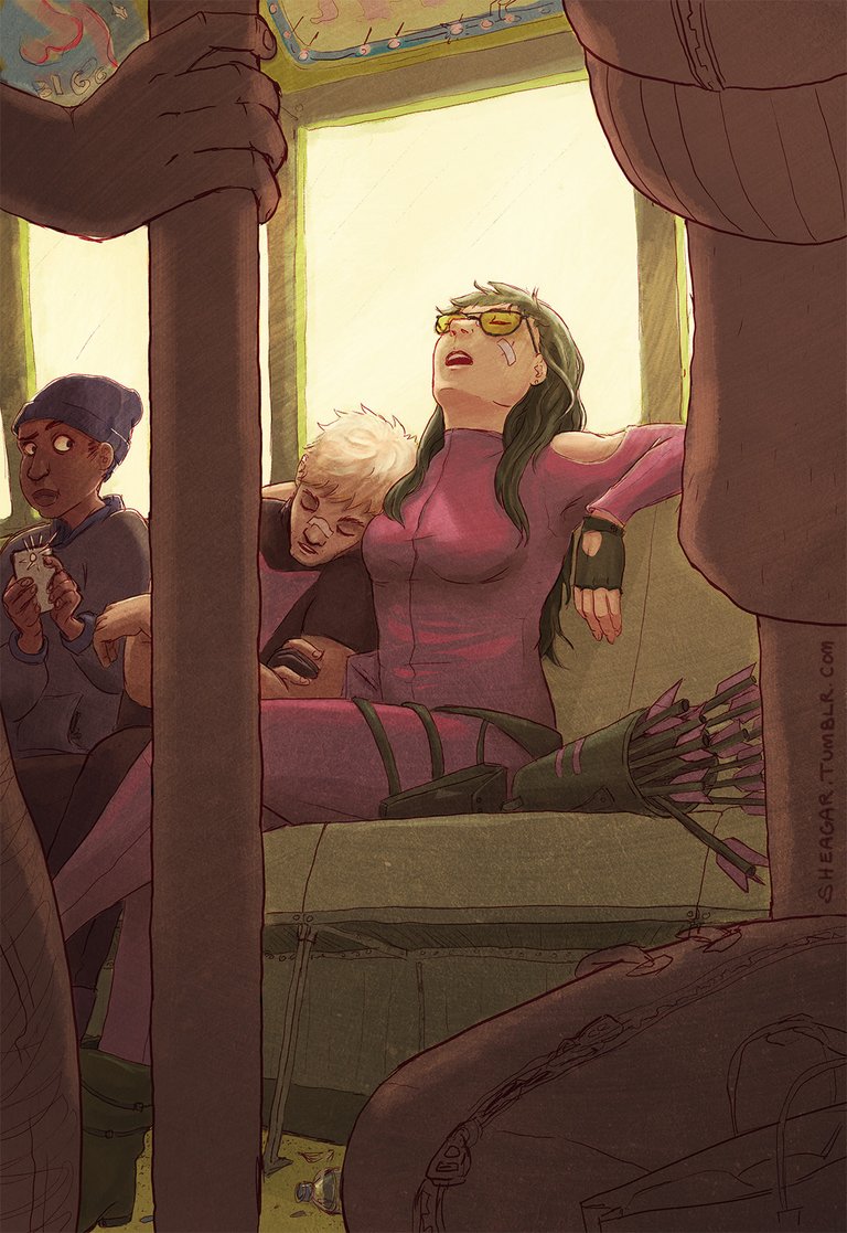
It isn't always necessary, but a simple texture added to a piece and prevent something created digitally from becoming too flat. Some artist prefer that look, but I've found that I my work looks most finished when I use it. Although, it possible I use it to just hide some of my mistakes...
Light
But besides that, this piece looks as good as it does because of the lighting I chose, and how that works with the colors. There is an atmosphere that is warm and soft that you just can't feel looking at just the line work alone. If I chose any other option, in all likely hood I would have confused the viewer on what to focus.
In conclusion, I had a lot of things pulling this piece together. And honestly I can look at this piece and see several mistakes I'd love to fix, but that's just the curse of a developing artist. But I think my choice of using a palette and pushing the lighting to be as dramatic and soft as possible made it one of my best pieces.
Afternote
These are the characters Clint Barton and Kate Bishop from Marvel's Hawkeye comics. I made this for a Comic Book Covers class last year.
Really beautiful job. That texture after the color really seals the deal, great touch I'm not sure everyone would take the extra time to do.
It's not even something I always take time to do, but it really does help the piece. so thanks!
wonderful illustrations!! Lighting is very important in creating visual stimulation.
I honestly don't use it enough. I get too lazy. But I've been trying to do it more and more.
I have the same problem, I know to do stuff I just get interested in the composition and there goes my lighting effect until a later date when I realize I past up a chance to do apply it to a new piece of art.
Knew the characters right away! Great post!
They are great and extremely underrated. The Hawkeye comics by Fraction will always touch my heart! <3
Great job keep posting
I will try my best! <3
thank you for the explanations
no problem! I'm glad I took some process screencaps! haha :D
Thanks for the beautiful picture and good explanation:)
no problem! and thank YOU! I don't always have this much behind a picture, but this one was very satisfying to write about. <3
WOW! I am in love with your style. The color palette you used is perfect and expresses that tired feeling you captured in your subject. I really appreciate the interesting vantage point that you place the viewer - this always makes the image so much more captivating and really draws the viewer in. I love your line quailty - the sketchy bits that still come through. I am following you and can't wait to see more of your work!
Thank you, the vantage point was one of the more difficult aspects to create, so I'm glad it's appreciated. <3 Thank you for following me! :)
You got magic in your hands.
aw wow thank you!!
You are a Good painter and also a Good Teacher
thank you darling!
Your art is great! You are very talented and i'm going to keep coming back to your blog to check more of your work in the future.
i'll be looking forward to it! thanks!
Beautiful man great job hatts off!
Great walk through of your process and thinking.
Amazing post. Following you :-)
ayye thanks!
Great
( My dear please vote on my page for your vote great honor )
Wow amazing work ! I mostly do furniture design and concept illustration. Definitely will follow and look forward to more work!
that is a pretty different field, but it's always good to appreciate other kinds of art. <3 thank you!
Love it. Perhaps I could use images of yours for some of my posts. I have a lot of stories that I want to bring to Steemit from my outside blog, and I want to substitute their images by Steemit ones. Could I?
sorry no, i appreciate the compliment, but I would prefer if you didn't. thanks. :)
oh boy....its really vivid the way u explained everything. Thank you so much....I am not professional like you but sometimes i try my hand at sketching an drawing...I am fully scared of oil colours. chalk pastels work well with me...
but this is just beautifully explained
thank you! although, i'm not actually a professional (would love to be, but i'm currently doing other things), you should definitely continue practicing with different media, even oil colours. if something scares you, you should try and get better at it anyway! keep doing art!!
you are so sweet :)
Great post! Keep it up :)
By the way, I'm following you now
Cheers
ooo! double thanks then!
article is full of rich text and colors love it
Cool, great post, love the drawing and color!
Really enjoyed your post, I'm new to digital art and Steemit, you just got another follower. Looking forward to seeing more!
oo thank you! i followed u back! looking forward to seeing more of your work and what you start doing with digital art!
Thanks for this great post !
This post received a 1.0% upvote from @randowhale thanks to @cryplectibles! For more information, click here!
Followed and Upvoted @SHEAGAR
thanks!
I loved the journey from the line quality to the color and then best of all the texture. That brought the piece to life. Great work!
thank you. very interesting. I want to try to repeat it
Wow great talent!
great article, you have an amazing skill!
Great composition and art style. You are definitely Marvel-ready.
thank you!!
You are good in what you do.
Thanks for sharing.
Awesome work, thank you for sharing the steps.
Also what are your influences? You have a distinct style, very different from comics I have seen :) (Followed)
ooo thank you! and uh, HMM. I guess I've never thought specifically about my style before, or what's influenced it. I've read a ton of manga growing up, but I wouldn't categorize it as that...But I also really enjoy a ton of recent american animation styles. So that could be influencing?? I honestly don't know. Ima have to think on that, thanks!
this stunning. haha I love how you use the textures. I use such devices as well to hid things. I like to add grain as well make it vintage like. CGI is just too smooth. good study :)