Beem logo proposal

Details
This is my proposal for the Beem logo task request for Utopian.io.
Idea
The guidelines for this logo were pretty straightforward:
- Use the pulley mechanism of a Beam Machine
- Incorporate the Python logo
- Create a simple, minimal design
- No color preferences
Disclaimer: I am aware that this proposal looks very similar to others due to the design restrictions imposed. I still think that this logo is a bit different.
Design Criteria
For this logo I wanted to evoke:
- Modern
- Simple
- Highly legible
I used a modern light type called Montserrat for the final logo available here
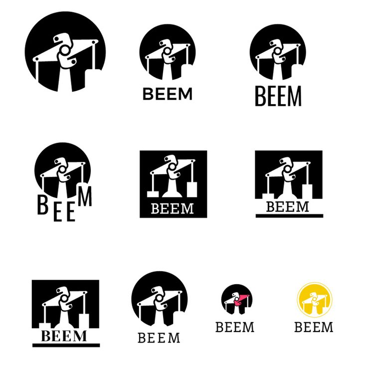
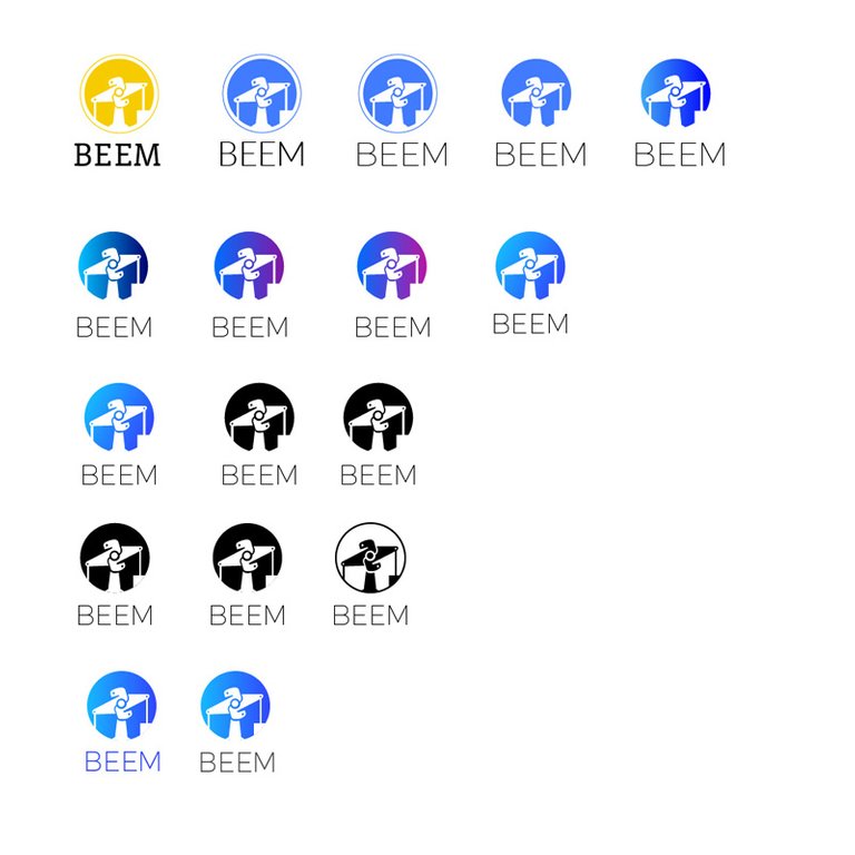
Logo Process
Screenshots of the process:

Color Exploration
Logo refinement
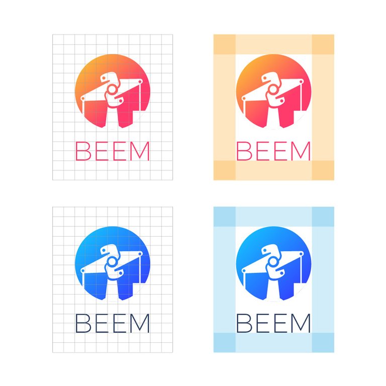
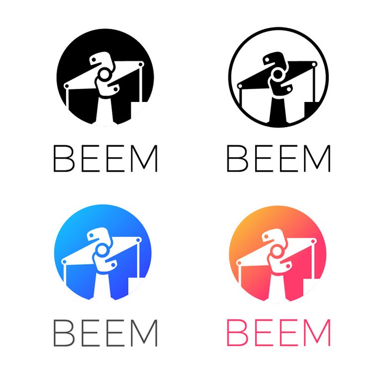
Final logo versions
I opted for two color options: warm and cool (blue). Plus negative and positive black and white versions.
Benefits / Improvements
A visual identity such as this will provide the following benefits:
- A visual element for all media communications
- An association with Python that clearly establishes a relationship with the logo and the service offered
- A youthful visual identity that will appeal to young audiences
- A simple design appearance that makes it memorable
Tools
I created the logo using Adobe Illustrator and the Mock-up image with Adobe Photoshop.
Original files in RGB color model for digital use, size 1024 by 1024 px in the following formats:
- .png
- .svg
- .jpg
- .ai CS5 and
Files are up for grabs here

This work is licensed under a Creative Commons Attribution 4.0 International License.
Feel free to use as you wish!
I hope you guys enjoyed seeing the process of this logo design. If you have any questions let me know in the comments. I usually read and reply to all of them. Thank you for your time and for coming by to visit.
Posted on Utopian.io - Rewarding Open Source Contributors
Hi, you are very talented! We would love to have you in our Facebook group.
We are waiting for you to share with us!
Steemit Designers
Thank you for your kind comment and the invite @radudangratian. I've already joined the group with my actual name, maybe that's why you didn't see me there as creativista ;)
naiii... i like it.. :)
why orange-pink..?
why not orange-blue.
It's a harmonic color palette @podanrj. I also proposed light blue to darker blue... The transition from a warm color to a cool color often generates a band of "dirty colors" in between. That's why I use harmonic color palettes i.e. colors that are next to each other in the color wheel. I guess these colors weren't welcomed lol, oh well :)
Which font did you use?
Ok, I fount it in your post :).
Monstserrat. It's a free Google web font. The link is in the post yes. Sorry for the delay.
I have selecting this contribution for my request.
Thank you very much vor participating, @creativista!
Wow! Thank you @holger80! This is a nice surprise to wake up too :)
congrats!!!!!
Thank you @jbeguna04!
congratulations @creativista :)
Thank you @tabaloidee!
Great!
keep it up.
Thank you @abdulamanan. Thanks for commenting :)
You have done a great job!!! I am so glad your logo was selected :) congratulations!!
Thank you dear! Siempre me dejas los mejores comentarios. Cariños :)
Sin duda fue el mejor! Felicitaciones! Amazing!
Gracias @rvilov!
Approved. Great job.
Need help? Write a ticket on https://support.utopian.io.
Chat with us on Discord.
[utopian-moderator]
Thank you mod @andrejcibik! Wow, super happy to be approved.
Hey @creativista I am @utopian-io. I have just upvoted you!
Achievements
Utopian Witness!
Participate on Discord. Lets GROW TOGETHER!
Up-vote this comment to grow my power and help Open Source contributions like this one. Want to chat? Join me on Discord https://discord.gg/Pc8HG9x
Thank you @utopian-io!
wow ! simple n comfortable job ! carry on...
wov perfect work congrat
I wouldn't say it's "perfect" lol. But thanks for the encouragement @khaliloff. I'm pretty happy for the warm reception of my work :). Thanks for the follow.
Well done, congrats!
Thank you @naufal for stopping by to leave a comment :)
Nice job mate!
One quick thing here, not only to your contribution but for all visual identity/logo design to come.
I'm no expert on Design, I just try my best to not do ugly stuff haha, but, even when providing the inverse applications, I often see this kind of contributions without the corresponding dark background examples.
It makes a lot of sense for me, as a "client" to see those applications, It adds value to the contribution showing how versatile the design is.
Just my $0.02, feel free to point out opposite thoughts on it.
Thanks!
Thanks for commenting @hernandev. What you point out is absolutely true, there must be both "positive" and "negative" versions of the logo, plus a full-color one, if it exists. The "positive" or black is suitable for white and light-colored backgrounds, while the "negative" or white is suitable for darker colors, even black, and busy photographic backgrounds (check the first example in the post). You can see all three versions in the Final logos section, plus the first version suitable for dark backgrounds ;)